Napoleon’s tragic retreat, pictured: Minard’s famous infographic.
This one famous chart from 1869 tells the incredible story of one of the great defeats in military history.
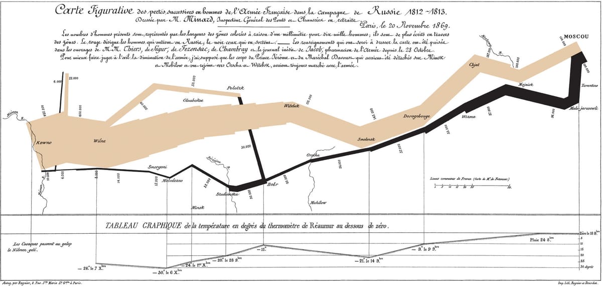
In the Modern World History class I teach at a middle school, we will soon be covering Napoleon and the tumultuous period of his reign and wars. While preparing for this recently I came across the above image, which is one of the most famous—and one of the first—“infographics” in Western history. This is sort of a map, sort of a chart and sort of a graph, but is not altogether any of these. It depicts in graphical form the size and strength of the great army of Napoleon Bonaparte, Emperor of France, during his invasion of Russia in 1812 (the top tan portion) and during the army’s retreat from Moscow. (You can click on it to see it a bit larger). Tens of thousands of Napoleon’s men perished on this disastrous campaign, not just Frenchmen, but also Poles, Italians, Germans and any other nationalities that the French officers could induce or impress into their army. After Moscow burned and Napoleon had to leave the Russian capital, his men died from starvation and cold in much greater numbers than those that were killed in battle by the enemy. Napoleon himself fled to Paris in a carriage in December, leaving the pitiful remnant of his army to trickle back to France. We’re not entirely sure of numbers, but according to this chart Napoleon set out with over 420,000 soldiers, and barely 10,000 made it back home.